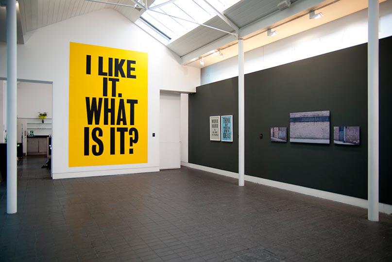
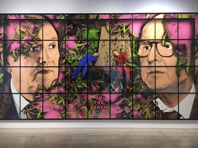
Artworld Insight for ARTUNER Magazine: "Martin Barré & The Provisional Painting"

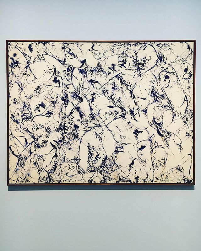
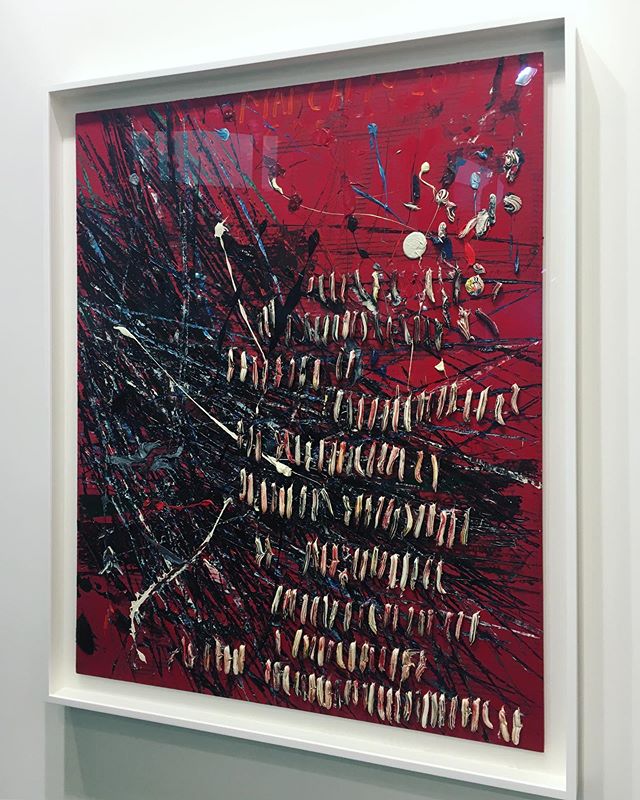
Martin Barre, 63-H, 1963

Martin Barre, 63-H, 1963

Published in ARTUNER, 03 February 2014

Transcending the period when modernist ideals gave way to a new set of aesthetic cues in contemporary art, Martin Barré’s (1924-1993) creative exploration of line, color, form and the two-dimensional surface is widely recognized as a milestone within the realm of art history. Presenting the viewer with a visual argument against the polite-passive intellectualism of traditional pictorial order, Barré’s oeuvre is mendaciously simple and minimalist. Communicating boundless variations of shapes and pigments within the self-imposed confines of the rectangular stretcher, his work investigates the delicate equilibrium that exists between notions of inner and outer space, figure and ground, completeness and provisionality.

Continue reading at ARTUNER

"Apoptosis/Lettre ouverte à une jeune fille morte"

Ariane Belisle, Lettre ouverte a une jeune fille morte, 2013

Ariane Belisle, Lettre ouverte a une jeune fille morte, 2013

You, a., have always used your body as a vessel of sorts. It appears concepts, fabricated narratives if you will, are endlessly more enthralling than the reality on which they are based. In fact, or rather in fiction, still ingrained on my retina is the mosaic of color that made up your face and body. The two-dimensional pixelated surface that momentarily became you. A fragmented version of you, of course. The facet you consciously chose to present to the world. Slightly parted bee stung lips, makeup meticulously applied, eyes that wore an expression lionized by Hitchcock’s leading ladies the moment they were caught like deer in headlights, left eyebrow provocatively raised (perhaps anticipating a reaction, #dareyoutothinkofthisassexy), legs extended and at times spread, fishnets, knee socks, petticoats, skin and the meaning it carried – the ongoing significance of steel and flesh, you thought to yourself. Click. Post. Likes. Self-expression in the noughties. Prohibition is destruction. Welcome to the exhibitionist club.  

You thought of your body as a vehicle for social change and with that belief came an empty Cindy Shermanesque promise of meaning. Hiding behind this veil of dubious significance, you must have felt comfortably detached from the girl you featured time and time again in your photographs – the urban sophisticate, the damsel in distress, the waif, the heroine, the nymph, the seductress, the floozy, the Miss over Mrs. Your I was malleable. You assumed stringing your persona through these disconnected signifiers would reveal gender biases within the realm of art history and media culture. And you hoped that the images would, in turn, be injected with substance and anchored within a greater theoretical framework. A noble motive to be sure, but what framework, may I ask, did you have in mind? Had you read anything by Craig Owens or Rosalind Krauss? Much like you, they contended that representation is pre-coded and championed the notion that play-acting can be used as a tool to critique the idea of femininity as a masquerade. Questioning master narratives, their viewpoint challenged first generation feminists to redefine the mythical femme. The truth, as one of your photographs’ titles suggested, is rarely pure and never simple.

Riding this new tide of feminism, a wave carved by countless before you, you shied away from imagery rooted in what we conceive to be an intrinsically female experience – childbearing and the iconography of corporeal differences. Instead, you chose to hone in on the construction of meaning within a culture that had proliferated the artificial commonality of batting eyelashes and pouts. Lost in a vortex of endless repetition, empty signifiers morphed into regurgitated stereotypes as you painted your face with a sensuous look learnt. Pubescent folly in imitation of some simulacral feminine essence. A copy with no original. Click & Repeat. Your captures, captured at 1/500 s, froze the apparent reality as a sign. The medium’s two-dimensionality was reflected in the stills you created, as none could mirror any form of human complexity. Destabilizing and fragmenting the female subject, yours is an accurate depiction of the female object. 

Much like the degenerate beauty queens and selfie-inflicted camwhores of your era, you pranced before a pervasive analog eye. Did you concur, as Jacques Lacan had decades before you, that voyeurism does, in fact, deny women human agency? You rehearsed this structure with ease, framing the girl – it – in a series of endless reiterations of her subservience and his control. Vacillating between reification and critique of the established order of femininity, and between celebration and decelebration of male subjectivity, you partook in the very activity you wished to condemn in an attempt to condemn it. Then tell me, a., did you succeed in exposing femininity as a construct rather than something inherent? Did your masquerade overthrow the tyranny of the male gaze? 

Does Cindy Sherman come to mind, here? Her Untitled Film Stills, I agree, successfully subvert the male gaze. Their effectiveness lies within the palpable tension that exists between the character Sherman is depicting and her own identity. Overturning the notion of the self-portrait, her performance is central to our understanding of the images. Unlike you, a., the self she pictures is an imaginary construct. Lights. Camera. Act(ion). To redouble and rephrase, it is only through Sherman’s interrogation of her own identity that we are led to explore female identity as a figment. 

Your subject, on the other hand, is subjected. Did you notice these self-portraits quietly cropping up in concurrence with your sporadic bouts of crashing insecurity? Each new photo was produced as a resounding affirmation of your place within a world where you equated your self-worth to your desirability vis-à-vis the opposite sex. You fed into the pervasive myths about femininity, perpetuating the status quo. Yours was not a face that launched a thousand ships, but rather one that publicly exhibited your private struggle with dysmorphophobia, anxiety and insecurity. A portrait of the young girl in all her candor. Click. Did self-portraiture present you with a release from who you were? Were you comforted by this simple act of drowning in a simulacral version of who you aspired to be? Could it be that your photographs were met with success simply because they did not menace phallocracy but rather confirmed it? Does the truth cut deep? My questions linger like thought bubbles. 

They say a photograph has the ability to guide us back into ourselves. You, a., always liked this notion. Vague and all encompassing, it attributed meaning without discerning it. It allowed a picture to transcend its primordial function as a record of real life and morph into a portal through which substance could be derived. Salvation. Mute, your images craved this completion. But always remember, a., that perception is never passive – it fills in the blanks, injects and cements. Through this new lens, it is difficult to dismiss your stills as vacuous constructs; they were, and continue to be, the reflection of a young girl’s vulnerabilities and insecurities. Perhaps this is a social comment within itself. A picture of the now, in all its gory.

Today, we are post-mystery, choosing to visually document our existence. Images made up of liquid crystals momentarily flash up on a computer screen, only to disappear again. It is on this stage that the female form is incessantly replicated as an object on display. The boundaries of her body begin to erode. Yet, each click is an act of self-realization. While you presented your body as something inherently vulnerable and private, it was also public. Preceding the self – yourself – it physically projected your image to the world and came to constitute a facet of your identity, as well as female identity. Frozen in celluloid within the plastic frame of a computer monitor, you existed.

And now the hand that created you wavers as the conclusion of this task draws near. One swift motion of my index finger and you will be gone. Are you sure you want to delete this photo? [Pause for dramatic effect] And then finally: Click.

Text for Create to Inspire: "Influential Artist: Diane Arbus"

Diane Arbus, A Young Man in Curlers at Home on West 20th Street, NYC, 1966

Diane Arbus, A Young Man in Curlers at Home on West 20th Street, NYC, 1966

Published in Create To Inspire, 08 January 2014

Rejecting conventional aesthetics in a raw and unsentimental manner, “straight” photography emerged in the 1930s as a counter movement to pictorialism. Vacillating between fine art and photojournalism, these new images sought to provide an analytical and descriptive look at social landscapes. The movement came to its full maturation in the 1950s when it was met with commercial success. It is within this framework that Diane Arbus (1923-1971) and her eerie portraits of the real rose to prominence. Discarding the niceties of fine art and fashion photography, her images championed fact over fiction, as her subjects took center stage.

Instantly recognizable through their consciously un-artistic modality, Arbus’ pictures echo a defined set of aesthetic cues. Often set in New York City, the depicted scene embodies the look of a film noir – a stylistic earmark of the New York School of Photography. While her photographs borrow elements of romanticism, they reject the sublimity commonly associated with the movement. Hence, her subjects, habitually placed in the center of the frame, are stripped of embellishments and treated objectively. Transcending their role as model, they inform Arbus’ perception and vision. The relationship that develops between the photographer, subject and viewer becomes an intrinsic part of her work.

Depicting those who, either by birth or by choice, lived within the seams of polite society, Arbus allowed ugliness, deviation and flaw to enter the realm of fine art photography. While each model’s visual distinctiveness permeates the image’s square frame, the most compelling aspect of her pictures is not the subjects themselves but rather their undeviating gaze that hints at a relaxed acceptance of one’s own individuality. Delicately revealing what society had been taught to turn its back on, Arbus’ body of work encouraged more than vicarious tourism into these people’s lives. Presenting viewers with a portal into another world, her photographs provoked a visual experience, as they ultimately acted as an assault on the polite, habitual blindness that was/is so prevalent in society.

Arbus’ contribution as a photographer did not solely rest in her choice of subjects. Rejecting the anecdotal descriptiveness of sensationalistic photojournalism, she challenged the presumed objectivity of the documentary by photographing the rituals of everyday life. Hence, while the reality represented is far removed from our own, it is at the same time hauntingly familiar and in no end stranger than ours. To redouble and rephrase, the subjects appear as characters of alienation. Yet, they hold up a mirror, prompting the beholder to investigate his own humanity. Destabilizing our concept of reality, Arbus documented a marginalized world rarely depicted – a world distinct from our own, it comes to almost represent the dreamlike for the common viewer. 

Greatly contributing to the history of photography, Arbus’ work is widely viewed as a phenomenon that changed the medium. She militated against the formal concepts of beauty, breaching the boundaries of what was acceptable, mostly through her choice of subject matter. Her main preoccupation was to expose a truth: “Photographs are the proof that something was there and no longer is. You can turn away but when you come back they’ll still be there looking at you.” (Geoff Dyers). For her, a photograph was a medium which could communicate and render a candid and fleeting reality.


Artworld Insight for ARTUNER Magazine: "A Brief History of Collecting"

Musei Wormiani Historia depicting Ole Worm's (1588-1655) cabinet of curiosities

Musei Wormiani Historia depicting Ole Worm's (1588-1655) cabinet of curiosities

Published in ARTUNER, 11 November 2013

Over the past decade, the art market has undeniably evolved. Remarkably resilient in the wake of the financial crisis, artworks have become tangible assets for international investors. Riding the tide of globalization, a new influx of collectors has emerged within South America, Asia and the Middle East, while the acquisition of art online has provided buyers with an unparalleled level of access to masterpieces worldwide. Needless to say, there is a stark contrast between collecting in the Digital Age and the sixteenth-century practice from which it stems. Yet, investigating the historical genesis of this pastime highlights the emotional, aesthetic and intellectual qualities that continue to inspire collectors today.

Epitomizing the magnitude and diversity of a sixteenth-century cabinet of curiosities, Rudolf II, the Holy Roman Emperor’s (1552-1612) kunstkammer (or art-room) held 470 paintings, 69 bronze figures, 179 ivory objects, several thousand medals and coins, 403 Indian curiosa, 600 vessels of agate and crystal, 50 amber and coral pieces, 185 uncut diamonds and precious stones, 174 works of faience, 300 mathematical instruments, numerous taxidermies, and countless other items. Arguably the most important collector of his time, the Emperor’s kunstkammer speaks of the breath and depth of collecting during the Renaissance period. While categorical boundaries were yet to be defined, these cabinets of curiosities acted as a precursor to the art of museology and collecting.

A characteristic product of its age, Rudolf II’s encyclopedic collection sought to paint an image of the universe, as it reflected the connoisseur’s pansophical view of the world. Exhibiting works of art and antiquities, as well as the physical world of phenomena, the intent was to amass objects that formed an intrinsic part of the universal system. Thus, elements of natural history, geology, ethnography and archaeology rubbed shoulders with religious relics, paintings and sculptures. These cabinets of wonder morphed into a microcosmic theatre of our macrocosm where collective memory and one’s own personal history were displayed.

Privileging empirical knowledge, a well-rounded experience of the objects through an active involvement of all five senses was fundamental. Olfaction in particular was valued (herbariums, for example, oozed exotic aromas). The devaluation of smell in the eighteenth and nineteenth centuries inscribed an important break in the history of collecting, as a palpable shift from the ephemeral to the aesthetic occurred. Philosophers and scientists of that era eulogized sight as the ‘pre-eminent sense of reason and civilization, [while] smell was the sense of madness and savagery.’ [1] A ‘coarse sense’ according to Immanuel Kant, smell saw its demise and visual culture quickly flourished.

Flowing from this fundamental insight, the attractive presentation of these opthalmoceptive pieces, as opposed to their secretive storage, became integral to the art of collecting. This novel form of exhibitionism expressed collectors’ conviction that displaying their artistic treasures in such a manner was sure to enhance their beauty by the astute juxtaposition of the objects with their setting. The Wallace Collection in London and the Frick Collection in New York, both still on view today in their original dwellings, illustrate this ruptured continuity with their sixteenth-century antecedents.

While similarities between the Age of Discovery’s haphazard kunstkammers and the Romantic era’s lavish displays of art may be few and far between, one in particular can be observed. Cabinets of curiosities frequently featured items amassed from the connoisseur’s travels. Morphing into relics of his life journey, they also bore their own past. Likewise, eighteenth and nineteenth-century collections were inevitably punctured with one’s own story, whilst also communicating each artwork’s provenance, literature and exhibition history. Further illustrating this point is the bequeathment ritual that is common to most, if not all, historical collections, be it of rarities or of art. This simple act of handing down to future generations spoke of the value placed on both the past and the future.

Today we live in an era characterized by technological abstraction. Yet our culture’s priorities, its notion of value, are still intrinsically linked to our relationship with the physical object, the artwork. Collecting has undeniably blossomed since the Renaissance period. With the advent of the Internet, the mediums through which we acquire art have moved into the virtual sphere. However, the factors that determine the collectibility of an artwork have remained unchanged. To quote Iwona Blazwick in last week’s Insight: “Above all you have to be moved by it, be curious about, love, admire, even be confused by the work of art.” Acquiring art grounds us to something tangible; and in this sense, the practice has endured as a physical exploration of both our collective and personal histories.

[1] Classen, Constance, David Howes, and Anthony Synnott. Aroma: The Cultural History of Smell. London: Routledge, 1994, p. 4

Recommended reading

Altshuler, Bruce, ed., Collecting the New, 2006

Arnold, Ken, Cabinets of the Curious: Looking Back at Early English Museums, 2006

Cummings, Neil, and Lewandowska, Marysia, The Value of Things, 2000

Elsner, John, and Cardinal, Roger, ed., The Cultures of Collecting, 1994

Haskell, Francis, Rediscoveries in Art: Some Aspects of Taste, Fashion and Collection in England and France, 1976

Hermann, Frank, ed., The English as Collectors: A Documentary Chrestomathy, 1972

Hook, Philip, The Ultimate Trophy: How the Impressionist Painting Conquered the World, 2009

Impey, Oliver, and MacGregor, Arthur, The Origin of Museums: The Cabinet of Curiosities in Sixteenth and Seventeenth Century Europe, 1985

MacGregor, Arthur, ‘Collectors and Collections of Rarities in the Sixteenth and Seventeenth Centuries’, in Tradescant’s Rarities: Essays on the Foundation of the Ashmolean Museum, 1983

Pearce, Susan, On Collecting: An Investigation into Collecting in the European Tradition, 1999

Taylor, Francis Henry, The Taste of Angels: A History of Art Collecting from Rameses to Napoleon, 1948

Review for Hermie Island: "Welcome to the Arts Club: Frieze Art Fair 2013"

Frieze Art Fair, London, 2013

Frieze Art Fair, London, 2013

Published in Hermie Island, 28 October 2013

Regent’s Park, London

18 - 20 October 2013

Daisy lies on the temporary gallery floor seemingly unaware of her surroundings. Her right wrist wears a label bearing her name – a name that conjures ingenuousness and youth in its purest form. Her body is contorted; her actions, suspended in animation. Transfixed, visitors gather. Disheveled lackluster hair is juxtaposed against a vivid pink dress and fluorescent yellow leotards. Her face conveys a tragic look learnt, as her eyes wear an expression similar to those favored by Jean-Pierre Jeunet and Marc Caro in La Cité des enfants perdus (The City of Lost Children, 1995). Her angst is palpable. An archetype of childhood and innocence lost, she communicates the bitter existential emptiness of contemporary life, and forces us to examine our own materiality within the art space. Unprompted by the gallery staff, Daisy stands. Visitors look on, eagerly awaiting the conclusion of her performance. She runs to a woman with a pushchair as a gallerist impatiently snatches the label – the conduit for this social experience – from her and places it next to its respective art piece. Stripped of her contextual framework, ‘Daisy’s’ actions are rendered meaningless. Inadvertently engaging with Nicolas Bourriaud’s esthétique relationnelle or relational aesthetics, ‘Daisy’: The Rise and Fall (more accurately renamed) literally boasts the prevailing “anything is art” cliché summary of contemporary art. Mother and child disappear behind a row of glistening Jeff Koons sculptures at Gagosian, as a wave of nervous laughter erupts within the space and red Louboutin soles scatter. This is Frieze 2013. Welcome to the arts club.

This year marks the eleventh incarnation of Frieze Art Fair, and with it comes a new wave of international collectors, dealers, curators, critics and visitors who mistake children for artworks. 151 galleries unite to create a dizzying FoMO fairground where tortoise framed glasses, slicked back power hair, statement jewelry and Chanel handbags (“Chanel Bags the Biggest Fans at the London Frieze,” the Guardian reports) parade along the aisles to see and be seen. Constellations of star-studded bomber jackets and Cuban heels form around works that encourage viewer participation – a tangible side effect of our current obsession with surface-level interactivity, no doubt. Find it in the Twitter feeds, Facebook likes and incessant hashtagging. This is what our generation craves.

Frieze Projects, a program of artist’s commissions realized annually, amplifies this circus funfair vibe, exhibiting experimental audience-participatory artworks. Ken Okiishi’s carnival-style installation is no exception, as visitors are invited to fire paint guns with the help of remote controlled robots. The colors red and green explode on random targets, whilst they are violently bombed behind a protective Perspex sheet. Next door, Lili Reynaud-Dewar transforms an intimate bedroom setting into a public arena (Untitled, 2011). Comfortably nestled on the bed’s plumped-up pillows, the performance artist reads Guillaume Dustan’s autobiography Dans ma chambre (In My Room, 1996) as an ink fountain freely flows out of the mattress’ center, saturating everything in its proximity. Acting as a sounding board, the spectator becomes an integral part of the work.

Emerging from Frieze Projects, an unruly queue begins to form at the Stephen Friedman Gallery to enter Jennifer Rubell’s Portrait of the Artist (2013), a white fiberglass sculpture of a colossal pregnant woman lounging on her side. In place of her belly, there is a void within which viewers can climb and morph into living fetuses for the ultimate rebirthing experience. A few rows down at PSM in Frame, one is invited to face impending doom by standing beneath Eduardo Basualdo’s mammoth beehive-like formation (Teoria (Theory), 2013). Vacillating between the repressive and liberating strains of calamity, its cataclysmic quality incites the beholder to fathom the installation’s eerie impenetrable depths. From protected womb to looming mortality, the visitor’s journey echoes John Barth’s mythotherapeutic notion that everyone is the hero of his own life story.

A star in her own cinema, a woman stands before Olafur Eliasson’s Fade Door Up (Working Title) (2013, Tanya Bonakdar Gallery), her camera phone at the ready (#selfie). The mirrored piece reflects her body while concealing her face. Spectator and artwork amalgamate to become one. At first glance we dismiss it as a vacuous encounter, yet it speaks of popular culture, circularity and feedback. Further along, a spiraled Plexiglas pavilion by Dan Graham (Groovy Spiral, 2013, Lisson Gallery) warps the booth it occupies, enticing visitors to enter. Cocooned in the spherical structure, participants escape the surrounding cacophony. On display to onlookers, bodies navigating the glass maze articulate the social implications of architectural systems. Restructuring our perception of time and space, the installation demands a reflection of our selves within the art gallery. More importantly, it encourages viewer participation, engagement, interactivity and play – something too easily forgotten at a fair where pretension and posing often prevail. Much like ‘Daisy’, it is through these humble encounters with the artwork that meaning is construed.


Text for the Artist's Website: "Michael Vickers"

Michael Vickers, Neon, 2016

Michael Vickers, Neon, 2016

Published on MichaelVickers.org, 27 August 2013

Vacillating between painting, sculpture and installation, Michael Vickers’ modulating forms develop an autonomous and distinctive visual language. Insistently remodeled industrial sheets of metal, folded fabric and molded plexiglas morph into artworks, as gradients of brightly-hued paint camouflage their unyielding surfaces. By relying on acts of negation, and investigating notions of inner and outer space, the compositions simultaneously convey familiarity and strangeness, weightlessness and mass, fragility and monumentality, playfulness and menace, completeness and provisionality.

Seeping art historical references, the works speak of the 1960s minimalist ideology, of Donald Judd’s finish fetishism and geometric impulses, of Richard Serra pouring and folding metal, and of John Chamberlain contorting automobile parts. Yet, Vickers’ engagement with independent themes and the obliterative qualities of matter lend his practice a unique position within the context of contemporary art. The calculated creases and folds – a palpable reference to Gilles Deleuze – are remnants of an interaction between the artist and his material, a depiction of the transitional moment of struggle before the medium yields. They eloquently recall the physical actions by which they were brought into being; and in this sense, never cease to exist in liminal space. Colliding with this facture element, a destructive impulse can also be perceived, as the act of creating oscillates between transformation and defacement. Arguably, this places the artworks within a realm of transgression, of George Bataille’s informe or formless, of sculpting and painting understood as a primal urge to mutate, disfigure, embellish and transform.

While their physicality arrests motion, anchoring the art in a specific temporal continuum, their chance placement within divers contextual frameworks points to the ephemerality of these captured moments. Needless to say, there is a claustrophobically tight circularity between the spectrums of time and space. Reacting to – and at times reflecting – the light and characteristics of their milieu, they transcends their function as mere objects. Hence, it is through presentation that the potential of matter is explored and meaning, attributed. Moreover, the insistent materiality of the installations firmly places the viewer alongside them in the gallery space. Seemingly dancing with the beholder, the pieces become the protagonists of a concealed narrative, as one’s perception and spatial relationship to the works develop the creative process.

Capturing a sense of urgency and immediacy, Vickers’ practice favors negation, provisionality and occluded beauty. More than a testament to artistic intuition, the works are, in the artist’s own words, a celebration of the seductive and poetic qualities of form.

Review for This Is Tomorrow: Contemporary Art Magazine: "Jockum Nordstrom: All I Have Learned and Forgotten Again"

All I Have Learned and Forgotten Again, Camden Arts Centre, 2013

All I Have Learned and Forgotten Again, Camden Arts Centre, 2013

Published in This Is Tomorrow: Contemporary Art Magazine, 06 August 2013

Camden Arts Centre, London

26 July - 29 September 2013

Presenting viewers with a portal into the artist’s subconscious mind, Jockum Nordström’s major survey of work at Camden Arts Centre brings together graphite drawings, watercolours, collages and architectural sculptures. Exhibiting the breadth of his creative output from the 1990s, as well as contemporary pieces commissioned for the show, ‘All I Have Learned and Forgotten Again’ oozes ingenuous charm and childlike wonder. Cutout Victorian figures clad in stiff clothes and crinolines, hymenoptera, game, crustacean, harpsichords, schooners, rock formations, and modernist architecture are suspended in animation on the gallery walls, as a form of visual fantasia unfolds within the space. 

Continue reading at This Is Tomorrow

Review for This Is Tomorrow: Contemporary Art Magazine: "Jerwood Encounters: After Hours"

After Hours, Jerwood Space, 2013

After Hours, Jerwood Space, 2013

Published in This Is Tomorrow: Contemporary Art Magazine, 28 May 2013

JVA at Jerwood Space, London

15 May - 23 June 2013

Presenting visitors with a portal into the creative minds of graphic designers, Jerwood Encounters: After Hours… An exhibition of personal work by graphic designers exhibits work created free from the constraints of a client, brief or fee. Concepts and projects traversing myriad media and themes unite under this overarching premise, whilst personal artistic impulses and passions are explored, and that flash of brilliance that is inspiration, exposed. 

Continue reading at This Is Tomorrow

Review for This Is Tomorrow: Contemporary Art Magazine: "Pae White: Too Much Night, Again"

Too Much Night Again, South London Gallery, 2013

Too Much Night Again, South London Gallery, 2013

Published in This Is Tomorrow: Contemporary Art Magazine, 22 April 2013

South London Gallery

13 March – 12 May 2013

Dissolving the boundaries between fine and applied art, Pae White’s immersive site-specific installation ‘Too Much Night, Again’ at South London Gallery effortlessly merges art, design, craft and architecture. Vectorial lines of colored acrylic yarn spanning 48 kilometers concurrently coalesce and disperse, forming an intricate web that hovers hauntingly over the exhibition space. This vociferous three-dimensional crosshatching invites visitors to enter the work. Only when enveloped in its cocooned environment do words seep into our consciousness, as letters spelling “TIGER TIME” and “UNMASTERING” take form. While the colossal graphics gradually ebb and flow depending on one’s positioning, the fragile illusion they create burns itself onto the retina. The space is imbued with new meaning. 

Continue reading at This Is Tomorrow

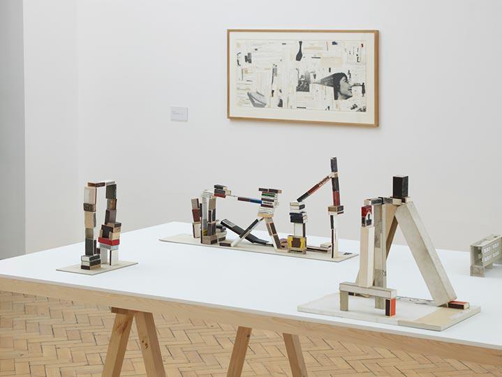
Review for This Is Tomorrow: Contemporary Art Magazine: "Drawing : Sculpture"

Drawing : Sculpture, The Drawing Room, 2013

Drawing : Sculpture, The Drawing Room, 2013

Published in This Is Tomorrow: Contemporary Art Magazine, 20 March 2013

The Drawing Room, London

14 February - 06 April 2013

Inciting viewers to revisit their preconceived definitions of both drawing and sculpture, the Drawing : Sculpture exhibition at the Drawing Room brings together twenty-one works by seven international contemporary artists who explore interconnections between the media. Vacillating between linearity and three-dimensionality, the pieces investigate whether the languages of drawing and sculpture are now intertwined or simply exist in parallel. 

Continue reading at This Is Tomorrow

"David Drebin, Ultimatum City, 2012"

David Drebin, Ultimatum City, 2012

David Drebin, Ultimatum City, 2012

Galerie de Bellefeuille, Montreal

25 August - 04 September 2012

Produced in 2012, David Drebin’s Ultimatum City catapults the viewer into the photographer’s imagined world. As if catching a glimpse of a fleeting moment, the beholder is presented with a portal through which another universe, removed from his/her own, can be experienced. Far from transient, the illustrated scene oozes narrative and intrigue, and at least upon preliminary inspection, there is no reason to doubt its authenticity.

Seemingly vacillating between reification and critique of established gender roles in Western society, the work depicts a woman fulfilling Drebin’s own rendition of the “damsel in distress” prophecy. While there is no male present in the photograph, we sense that he is just beyond the periphery of the image, as our heroine is relegated to a supporting role, indisputably acting in response to his actions. Helpless against the nocturnal panorama of imposing skyscrapers, her existence seems fleeting. The illusory nature of her performance is central, as the concept of performativity permeates the picture. Reality is swallowed by myth; only fantasy remains. Lionized through cinematic genres and popular culture, this proverbial scene has been witnessed before. Thus, a sense of familiarity is triggered within the viewer, as the narrative concurrently rubs shoulders with a recognizable dialect and an alien world. 

It is easy to advance a simulacral reading of Drebin’s Ultimatum, analyzing the photograph as referential. Formulated by Jean Baudrillard, the philosophical treatise describes the illusive nature of our constructed reality by the interaction of empty signifiers. Consequently, the image is released from a deeper meaning and exists only superficially as simulacra. It is precisely this strategy of conceptual appropriation from mass media idealism which proliferates, rather than denounces, the male gaze, as the beholder inadvertently morphs into a willing voyeur. Hence, the shiny pixelated surface of the image becomes as vacuous as the female it depicts.   

One could posit that the fundamental difference between art and entertainment is that the latter never posed a problem it could not solve. While it is difficult to dismiss Ultimatum on visual grounds, its placement – or rather misplacement – within the commercial art sphere both confounds and confronts. The image may gracefully adhere to a set of purely aesthetic rules, but conceptually it does not permeate the realm of art. Through Drebin’s implicit acceptance of established gender roles, the societal issue appears to be resolved. Or perhaps the problem, masked behind the photographer’s dazzling veil, was never exposed. 

Catalogue note for Sotheby's: "Gerhard Richter, Mädchen im Liegestuhl, 1964"

Gerhard Richter, Mädchen im Liegestuhl (Girl in Deckchair), 1964

Gerhard Richter, Mädchen im Liegestuhl (Girl in Deckchair), 1964

Sotheby’s London

29 June 2011

Deriving from the early period of his highly influential career, Mädchen im Liegestuhl (Girl in Deckchair) is a stunning photo-painting that exemplifies the quintessence of Gerhard Richter’s oeuvre. Exceptional on account of its very early date and its flawless execution, the work’s ethereal beauty also carries an underlying intellectual rigor that helped re-define contemporary painting, as well as conceptual genres.

Painted in a blurred, quasi-Impressionistic manner, Liegestuhl vacillates between figuration and abstraction, as it dismantles into a matrix of semi-abstract marks when viewed at close range. The geometric shape of the deckchair invites the viewer to take a step back; suddenly, the image seeps into our consciousness and grows in stature and complexity as we perceive it from afar. Richter’s strong pattern of lateral striations and sfumato blurring of contours give the work its delicate beauty. The brushwork is gracefully fluid: each individual stroke is lightly feathered into another, creating an alluring surface that undulates before the viewer. As if catching a glimpse of a passing moment in our transient world, the image is rendered a fragile illusion.

In the early 1960s, fast-paced mass-media photography replaced pictorial memory. This technological revolution had a direct impact on artistic production. The new form of visual art that appeared broke with tradition, as it incorporated the regular flow of press images. Following in the footsteps of American Pop artists, such as Rauchenberg, Warhol and Lichtenstein, Richter began using mass media images as a source for his work. This strategy of appropriation engaged with Duchampian debate, and to a certain extent with Walter Benjamin’s writings, as it subverted traditional artistic notions such as creativity, originality and high art in the age of reproducibility.

At a time when artists were putting down their brush in favor of less traditional approaches to artistic creation, Richter remained committed to the expressive power of easel painting, producing works as radical as the source photographs on which he based his oeuvre. Hence, the artist’s formal approach to image making was essentially removed from the mechanical processes of Warhol’s silkscreen and Lichtenstein’s pixilation. While Liegestuhl offers the image a photographic appearance, it bears witness to the painter’s actions; thus lending an aura to the photographic vision.

Shortly after its creation, Liegestuhl was shown in the milestone exhibition Neue Realistsen, Richter, Polke, Lueg, held in 1964, at Rudolf Jährling’s Galerie Parnass in Wuppertal. This exhibition was considered by many the pinnacle of the Kapitalistischer Realismus movement, within which Richter’s photo-paintings from this period are often classified. Occasionally satirical in their approach, the Capitalist Realists appropriated the pictorial shorthand of advertising. Depicting the mundane through ghostly blurred photographs, the movement sought to communicate a different intention to American Pop by representing a broader experience, a wider view of reality. This significant distinction is epitomized in Liegestuhl, as the source image finds its roots in the banal activities of everyday life. 

The composition of Liegestuhl was sourced in a photographic image from a 1962 German newspaper, illustrated on page five of Richter’s monumental cataloguing project Atlas. In the foreground, the work depicts a carefree woman lying in a deckchair among nature’s elements: earth, sea and sky. At first glance, the photograph may seem innocuous and prosaic; however, upon closer inspection, one realizes that we are peering through the subjective lens of Richter’s social agenda. Hence, although the work emanates feelings of freedom and serenity, it is also a powerful commentary on German bourgeois life of the early 1960s.

The artist revisits this theme in 1965 with Liegestuhl II. While there are marked similarities between the composition and subject matter of the two paintings, notable differences emanate – namely, the anonymity of the figure depicted in Liegestuhl I. The viewer craves to see the woman’s face and to have a human connection with her. However, Richter chooses to deliberately blur and distort his subject, draining her individuality from the painting and merging her with the upcoming wave. The artist’s blurring technique significantly alters the language of the photograph, consequently subverting its meaning. ‘I blur so that nothing will have an overdone, artistic look, but instead will be technical, smooth, perfect. Maybe I also blur the superfluous, unimportant information’ (Richter, Textes, p.32). In Liegestuhl, only the message remains, the subject is nullified and thus no longer stands for herself but becomes the personification of middle-class capitalist life in Germany at the time. This poignant tour de force acts as both a painterly and cerebral response to the societal climate of Western Europe in the early 1960s, as it actively engages with both identity politics and aesthetic theory. 

Simultaneously creating and obscuring a fleeting moment, Liegestuhl is an evocative image exemplifying Richter’s virtuosity with paint. Testifying to much more than a visually reported fact, the painting does not merely document mass-media data, it presents the viewer with a unique cultural commentary. Richter’s fastidious manipulation of this image constituted his own distinctive version of Pop, which challenged the cultural presumptions of the 1960s and still remains relevant today. Mesmerizing the viewer, Liegestuhl confirms Richter’s place as a highly pivotal figure in Contemporary art. 

Catalogue note for Sotheby's: "Giorgio de Chirico: Cavalli Presso un Castello"

Giorgio de Chirico, Cavalli Presso un Castello, c. 1961

Giorgio de Chirico, Cavalli Presso un Castello, c. 1961

Published in Sotheby’s London: Impressionist & Modern Art Day Sale Auction Catalogue, February 2011

Giorgio de Chirico had posited: ‘To become truly immortal, a work of art must escape all human limits: logic and common sense will only interfere. But once these barriers are broken, it will enter the realms of childhood visions and dreams’ (Charles Harrison & Dr Paul Wood, Art in Theory, 1900-2000: An Anthology of Changing Ideas, London, 2002, p. 58).

Depicting three horses in a near caricatural and expressionistic style. Cavalli presso un castello dramatically revisits one of de Chirico’s most iconic images, reaffirming the subject within the artist’s œvure. Although the work was executed at a time when the art scene found itself divided between abstraction and figuration, the artistic style is reminiscent of the baroque, as it recalls a painterly approach. A true pioneer of his time, de Chirico was one of the few artists who sought to innovate contemporary approaches to painting, while reinterpreting a classic artistic language anchored in tradition. Hence, the resultant artwork creates a ruptured continuity with past artistic traditions, as well as the artist’s own style.

Catalogue note for Sotheby's: "Pablo Picasso: Femme, peintre et modèle"

Pablo Picasso, Femme, Peintre, Modele, 1953-54

Pablo Picasso, Femme, Peintre, Modele, 1953-54

Published in Sotheby’s London: Impressionist & Modern Art Day Sale Auction Catalogue, February 2011

Femme, Peintre et Modèle is an exquiste illustration of Picasso’s incredible talent for draughtsmanship and the intensity of emotion with which he created the famous series of drawings in the winter of 1953-54, of which the present work is one.

Writing about this period, Marie-Laurencin Bernadac observed: ‘Between 18th November 1953 and 3rd February 1954, Picasso shut himself away in the deserted villa and produced at a dizzying pace 180 drawings which have as their central theme the painter and his model. Some of them additionally summon up and incorporate themes from the past: the circus, clowns acrobats and monkeys. Others anticipate the future: masks, old age, eroticism, jokes at the expense of the painter’s trade, the comedy of the art milieu (Late Picasso, Paintings, Sculpture, Drawings and Prints 1953-1972, The Tate Gallery, London, 1988, p. 51).

Thesis for The Courtauld Institute of Art: "The Facture Factor: Tracing the Artist's Hand and its Value in the Changing Art Museum"

Andy Warhol, Campbell's Soup Cans, 1962

Andy Warhol, Campbell's Soup Cans, 1962

Published by The Courtauld Institute of Art, 2010

Challenging Walter Benjamin’s premise of aural alienation in the age of mechanical reproduction, this dissertation explores the sustainability of the aura in works of art that dissolve the romantic notion of the artist’s touch. In doing so, it will examine the decline of eighteenth and nineteenth-century cast courts, and the unfeasibility of André Malraux’s proposed Museum Without Walls, as these display methodologies tried to do without the original work of art. Focusing on the specific cult of the artist, this research paper will further scrutinize the artistic production of Old Master studios, as well as modern and contemporary artist factories, both of which employed workshop assistants, fostering a disconnection between the artist and his craft. Suggesting that aura and facture are not necessarily related, this dissertation will argue that a workshop-crafted artwork’s aural quality is upheld through the cult of the celebrity artist.

The analysis will largely be based on aesthetic theory, as well as the scholarly knowledge brought forth by archival material, catalogues, annual reports and interviews with artists, museum professionals and auctioneers. While this thesis largely focuses on the specific case studies at hand, the project develops a model for thinking about the cult of the maker and the cult of the artist within the museological sphere.

Press release for The Courtauld Gallery: "Blood Tears Faith Doubt, Historical and Contemporary Encounters"

Mark Fairnington, The Greek Madonna, 1993

Mark Fairnington, The Greek Madonna, 1993

Published by The Courtauld Gallery, 17 June 2010

The Courtauld Gallery, London

17 June - 18 July 2010

BLOOD TEARS FAITH DOUBT, Historical and Contemporary Encounters draws parallels between works of art from the 15th century to the present day to address themes of suffering, compassion, devotion and belief. It juxtaposes works to provoke an emotive response and to emphasise the continuing power of religious imagery, even in the secular context of the art gallery. This thought- provoking exhibition brings together painting, sculpture, works on paper, photography and decorative arts, and has been curated by students on The Courtauld Institute of Art’s MA programme Curating the Art Museum. Drawn from The Courtauld Gallery and the Arts Council Collection, it includes, among others, Old Masters Polidoro da Caravaggio and Giovanni Domenico Tiepolo, and contemporary artists Adam Chodzko, Siobhán Hapaska, and Grayson Perry. 

BLOOD TEARS FAITH DOUBT stages two encounters: between the works themselves, sparking dialogue between images of striking or surprising similarity; and between the works and the beholder, whose engagement and empathy with the subject and its portrayal remains central to the enduring power of religious art. The exhibition unites works from the Western tradition of Christian art and contemporary works that resonate with that tradition. It explores how these images were used and viewed historically, and considers whether their appropriation in contemporary art can evoke the same intensity of emotion as they did in the past. 

The central themes of BLOOD TEARS FAITH DOUBT are explored in the exhibition in rooms 11 and 12 of The Courtauld Gallery in three sections: mother and child; devotion; faith and incredulity. The first section presents images of the Madonna in various attitudes. She is seen as nurturing mother in Virgin and Child with Saint Jerome (1510-30) by Giampietrino, in Mark Fairnington’s The Greek Madonna (1993), and in the disturbing imagery of Grayson Perry’s Spirit Jar (1994). In Giovanni Domenico Tiepolo’s Lamentation over the Dead Christ (18th century), she is presented as a bereft and grieving figure. The Pietà is further recalled in the sculpted hand holding wilted flowers of Phil Brown’s Untitled (Hand) (1994). 

In the pivotal space of the darkened central room, two intimate, small-scale devotional works – Christ Crowned with Thorns by a follower of Dieric Bouts (c.1475) and an ivory diptych (14th century) featuring the Madonna and Child and a Lamentation scene – are presented in a setting which recalls their original function and power. 

In the final space, in striking contrast, life-size works confront the viewer. In Polidoro da Caravaggio’s painting Incredulity of Saint Thomas (1531-35), the disciple demands tangible proof of Christ’s resurrection. Alongside, Siobhán Hapaska’s Saint Christopher (1995) is a disturbingly real and immediate physical presence. Elsewhere, Adam Chodzko’s Secretors (1993), blood-red droplets of ‘manifestation juice’, are a subliminal presence, a ‘seepage from other realities’, as the artist describes them. 

This innovative exhibition offers the opportunity to experience rarely-seen and diverse works in unusual and provocative conversation. 

Review for Courtauld Reviews: "Yinka Shonibare, Nelson's Ship in a Bottle"

Yinka Shonibare, Nelson's Ship in a Bottle, 2010

Yinka Shonibare, Nelson's Ship in a Bottle, 2010

Published by Courtauld Reviews, Issue 5, June 2010

Fourth Plinth, London

24 May 2010 - 30 January 2012

Unveiled in Trafalgar Square in May 2010, Yinka Shonibare’s Nelson’s Ship in a Bottle now boldly adorns the fourth plinth. Vastly contrasting with the plinth’s previous occupant, the stoic (and, shall we say, humdrum) statue of Battle of Britain hero Sir Keith Park, Shonibare’s artwork playfully toys with the limits of kitsch, while still managing to retain strong political undertones. 

Memorializing the Battle of Trafalgar, the sculpture is the first commission for the fourth plinth suggestive of Trafalgar Square’s historical symbolism. As the title of the work suggests, the piece consists of a minutely detailed replica of Lord Nelson’s HMS Victory ship encapsulated in a mammoth Perspex bottle, corked and sealed with red wax. The replica’s seafaring precision only falters when confronted by Shonibare’s trademark batik print textiles, which are used for the ship’s sails. Symbolic of African identity and the legacy of British colonialism, the billowing, bright patterned sails add a new dimension to the work, as they sturdily hint towards postcolonial theory. Thus, the sculpture not only celebrates Nelson’s victory, but also London’s multi-cultural wealth, which, in Shonibare’s own words, ‘still breathes precious wind into the sails of the United Kingdom.’ Though the visual amalgamation of British history and the story of multiculturalism in London verges on camp, it is a successful one since it reflects the complexity of the expansion of British trade subsequent to Nelson’s victory which granted the nation the freedom of the seas. 

Needless to say, Shonibare’s message in a bottle resounds in the Square loud and clear, for all to hear, as the latest commission for the fourth plinth transcends the constrictions of sculpture and becomes a symbol in itself. Moreover, though Shonibare’s work is politically charged, it retains a childlike charm and sense of wonder that is sure to enchant even the most cynical viewer.

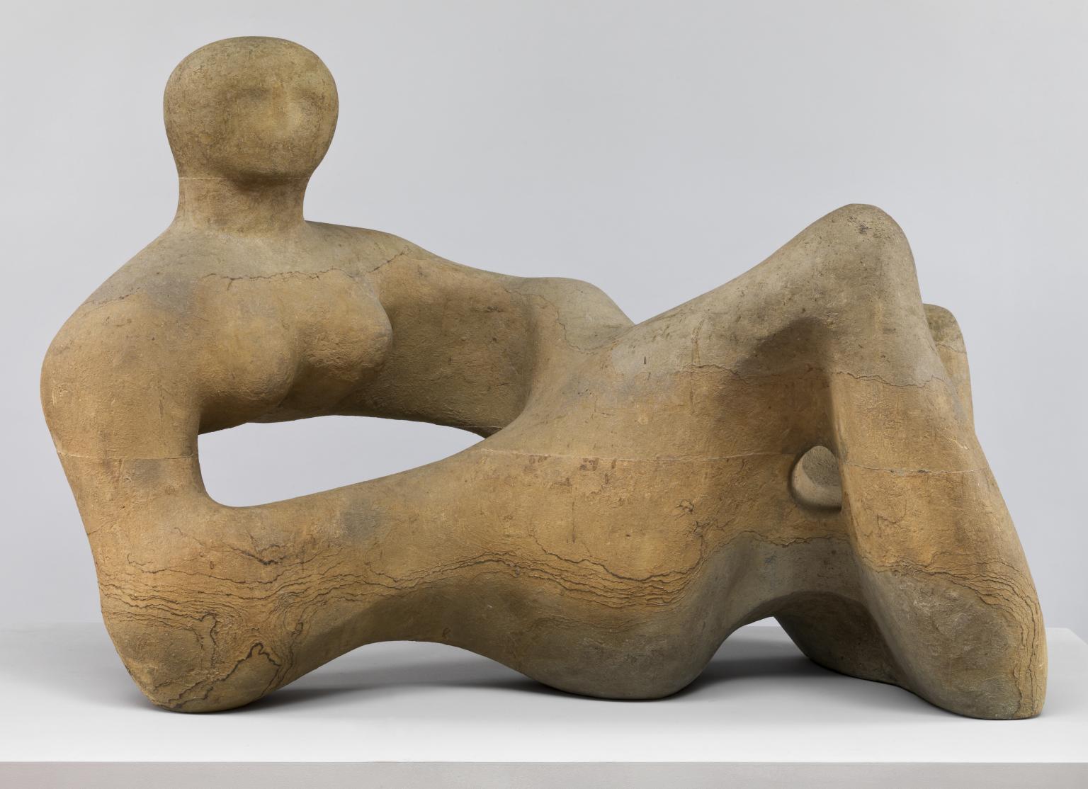
Review for Courtauld Reviews: “Henry Moore”

Henry Moore, Recumbent Figure, 1938

Henry Moore, Recumbent Figure, 1938

Published by Courtauld Reviews, Issue 4, March 2010

Tate Britain, London

24 February - 08 August 2010

While the 1988 Henry Moore show at the Royal Academy presented the sculptor as a romantic, Tate Britain attempts to reinvent Moore (1898–1986) as a radical, experimental and avant-garde artist. The artworks are given center stage in this exhibition, uncovering a dark and erotically charged dimension to Moore’s work that incites visitors to revisit their preconceived notions of one of Britain’s best-loved sculptors. Through the presentation of over 150 stone sculptures, wood carvings, bronzes and drawings by the artist, the exhibition explores the trauma of war, the advent of psychoanalysis, and new ideas of sexuality, non-western art and surrealism as frameworks within which Moore can be reborn. 

While the show’s revisionist aims are clearly stated in the introductory panel and constantly reiterated throughout the exhibition by means of wall texts and quotes, it is questionable whether these aims are successfully communicated to the viewer. The gallery spaces are decidedly empty of information. The wall panels are sparse and the object labels only provide tombstone information. Similarly, the room divisions seem disparate and the display of works, random. While some rooms explore Moore’s cultural influences (Room 1: World Cultures), others focus on subject matter (Room 2: Mother and Child), isms (Room 3: Modernism), historical periods (Room 4: Wartime and Room 5: Post-War) and materials (Room 6: Elm). For some visitors, this lack of direction may privilege a sensory response to the artworks or encourage viewers to address their own subjectivity. For others, the schizophrenic structure of the exhibition may elicit mystification and misunderstanding. While the exhibition engages with the canonical narrative of modernism and gestures towards meaning, there is no coherent grand narrative, as it is riddled with inconsistency. Hence, the show can be described as distinctly postmodern, but is this postmodern construction intentional? 

The answer is not immediately clear, as today’s art museum is a postmodern construction in itself. The curator is no longer the sole voice in an exhibition, since different departments often have divergent agendas. This has created a decentered museum and is reflected in the microcosm of the narrative of the Henry Moore exhibition, which also possesses a plurality of voices. Thus, perhaps the more interesting question is: Have the curators made a conscious intellectual choice to present the material in a postmodern way, or is the exhibition an indirect result of the postmodern construct of society in late-capitalism which also formulates the structure of the museum? The most plausible answer appears to be simply both. While the exhibition presents a revision of modernism, the decentered museum structure shapes and emphasizes the postmodern convolution of the narrative. 

Arguably, the audio-guide provides the strongest reading of the exhibition, as it successfully pulls together these different voices. Without it, the various modes of interpretation do not interrelate. In many ways, this digital technology becomes a lifebuoy to navigate the exhibition, as it constructs threads of meaning throughout a gallery space which often lacks cogency. Moore’s Reclining Figures and Mother and Child themes, for example, are interspersed in the various rooms, creating a sense of continuity. Similarly, the audio commentary constantly refers back to Moore’s approach to materiality, as well as elements from the artist’s biography, to construct the meaning of the various works included. It can be argued that these different ribbons running through the exhibition by means of the audio-guide give the exhibition its “true” meaning, negating to a certain extent its postmodern structure. 

While it is difficult to assess if the curatorial aim of the exhibition has been attained, it is immediately clear as one walks through the gallery space that there is ‘Moore’ to the artist than meets the eye. Arguably, this is where the success of Tate’s Henry Moore exhibition lies.